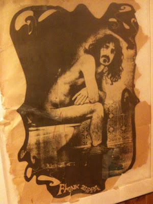
I took a quick va-cay in Vermont these last few days and came across this poster. I love the style, the subject matter is dead-on and even the way the poster is falling apart adds to the overall appeal. Where can I get one?
Tweet

 I saw the HELVETICA movie this week. Yes, it's a movie about a font, but it has a rich and interesting history and the movie is interspersed with a variety of designers (a few big names and then a few smaller ones) who either extoll the font's virtues or rip it to shreds.
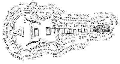
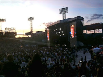 And then there is a video I took (again with the iPhone) of the light show and fireworks during Live and Let Die:
 I was at a party with friends this past weekend when I spotted something familiar. A 7-week old named Jonah was sporting the logo that I had created for a summer camp! What a kick it was to see something I had designed, completely out of context and while in my civilian identity (when I wasn't working). Isn't he a cutie?
 The logo went through many, many incarnations before we finally settled on this look, these colors and the gazebo which is one of the first things you see when you drive into the camp. I'm very proud of how it turned out.