Tuesday, December 29, 2009
Tuesday, December 22, 2009
Holiday Card 2009
On November 17 I received an email from a client asking me to produce her family's holiday card to make it into the mail by December 10. Sounds like plenty of time until you consider what needed to be done:
I was so happy to work with this particular client on her card. She was clear about what she wanted/liked and was able to communicate the changes she wanted to see.
Thank you C.M.!
- Conceive and design a tri-fold card (and in this case I was provided with wonderful photos by Steve Robb). Make revisions based on client's feedback.
- Hunt for paper samples at multiple stores to line the envelopes and scan and email them for client to choose.
- Order the envelopes.
- Order the chosen liner paper (this took 10 days to arrive. TEN DAYS and the day before I received them I was informed that my order would be short!).
- Find someone to address the envelopes (both regular and return addresses). Lauren Karp is a goddess.
- Go away for Thanksgiving. Wait for printer to reopen and send approved design.
- Get postage stamp options from which client may choose.
- Design the outside of the envelopes using colors from the card as well as colors from the liner and the postage stamp.
- Cut the liner paper. I did this by hand to make sure they were done right.
- Assemble the envelopes (attach the liners and stamps- thank goodness for self-sticking stamps!).
- Fold and stuff the cards (while keeping a critical eye out for any printing issue).
- Lick (bleh!). OK, not really- I used a sponge to seal the envelopes.
- Hand cancel at the P.O.
- Send client the following photo taken at the P.O. with my phone so she could see the completed package as I was canceling them.
I was so happy to work with this particular client on her card. She was clear about what she wanted/liked and was able to communicate the changes she wanted to see.
Thank you C.M.!
Tuesday, December 15, 2009
From My Sketchbook
I was at a condo association meeting the other night and there were so many unnecessary tangents that it gave me LOTS of time to sketch! Some of the conversations were about as important as what C.B. is pointing out here.
Monday, December 7, 2009
Skateboarder
A cross-hatch sketch from my sketchbook. Note that he's wearing a helmet- could you have guessed I have a kid?
Thursday, December 3, 2009
Faces, faces and more faces
Lots of faces using my new drawing pen. This is just a quick drawing- no pencil sketch first- and this time I decided to integrate what I imagined my characters saying. Have fun!
Monday, November 30, 2009
It's a bird... It's a plane...
I picked this drawing just for you...
I've been having fun with my new drawing pen. More sketches and info to come.
I've been having fun with my new drawing pen. More sketches and info to come.
Thursday, November 19, 2009
Oliver Hardy
I watched a Laurel and Hardy movie on Hulu last night- The Big Noise- and made this drawing between the bouts of laughter. These guys are still wonderful!
http://www.hulu.com/watch/81275/the-big-noise
http://www.hulu.com/watch/81275/the-big-noise
Monday, November 16, 2009
Thursday, November 12, 2009
Thank you Vegas!
I drew this on the airplane coming back from a Graphic Artists Guild conference in Las Vegas. More sketches from the conference to come soon...
Monday, November 2, 2009
Postcard Promos
It's time to get some postcards out to a few clients and prospective clients. I created 6 different promos with my illustrations to reach out to some editorial (magazine) art directors and children's book editors (respectively).
If you fall into one of the above segments (or similar), I'd be happy to send you a card.
If you fall into one of the above segments (or similar), I'd be happy to send you a card.
Thursday, October 29, 2009
Happy Halloween!
(Click the image to see it LARGER)
I'm really looking forward to seeing all the Trick-or-Treaters running around Saturday night, especially because this will be the first Halloween in our new house! My son is going as an astronaut (he's so cute in that costume with the HUGE helmet) despite his obsession with superheroes (can it be fueled by my obsession with superheroes? Hmm...).
As an added bonus, I've included a sort of before and after to show how one of the characters looks with all the shading and lighting taken out. That's the most time-consuming part but also one of my favorites: A different area of my brain takes over so I get to listen to podcast after podcast of This American Life and it doesn't distract me.
Happy Halloween! Please make sure your trick-or-treaters stay safe, and please drive extra slow Saturday evening.
Tuesday, October 27, 2009
Faces and characters
I like practicing drawing different faces with varying expressions and sometimes the page turns into a congealed mass where everyone is held together because of their proximity to each other (like when two drops of water suddenly connect).
I think my fave here would have to be the lady with glasses next to the dog. She's thinking: "Did he just say something?"
The guy with the 5:00 shadow is saying: "No no, I just couldn't find my razor this morning. Or yesterday."
I think my fave here would have to be the lady with glasses next to the dog. She's thinking: "Did he just say something?"
The guy with the 5:00 shadow is saying: "No no, I just couldn't find my razor this morning. Or yesterday."
Friday, October 9, 2009
Schizo shirt design
I've been designing t-shirts for many, many years. Recently, my wife, son and I moved to a new home and as I was cleaning out my office (no small feat) I found some notes on shirt ideas. At the time I jotted down the ideas, there was no way to sell crazy shirt ideas (there was always Spencer Gifts, I suppose) and get them out to a wide audience. Luckily, all that's changed now and there are many, many online sites to choose from. So does anyone have suggestions of where I should take this design (modeled by my awesome cousin Noa)? What sites do you like?
Here's an incomplete list of online shirt competitions:
Threadless (the Mama Bear of online competitions)
Designs By Humans
Wooshka
Uneetee
Withoutpockets
Shirt.Woot
Here Itself
Tilteed
Caponocca
Here's an incomplete list of online shirt competitions:
Threadless (the Mama Bear of online competitions)
Designs By Humans
Wooshka
Uneetee
Withoutpockets
Shirt.Woot
Here Itself
Tilteed
Caponocca
Tuesday, October 6, 2009
What I'm Working On: Damn Batcave
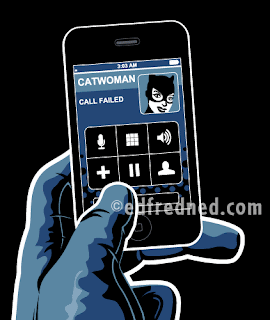
I've been working on this Batman illustration for a t-shirt design and finally came up with what I want on the iphone. It's late at night and he's trying to drunk dial (you don't have to have been drinking to drunk dial someone- just very, very tired) but his choice of headquarters is thwarting his hook-up attempt.
It was fun to illustrate just a small amount of the character to let the viewer figure out who he is (hopefully without hitting anyone over the head with it).
Whattaya think?
Anyone want Catwoman's digits?
my photo reference
Wednesday, September 30, 2009
Illustrations from calendars I've illustrated
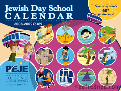 Thanks to those who sent me messages on yesterday's post of an illustration for the Jewish New Year. I've posted here further illustrations from a few different calendars I've illustrated (and designed) for PEJE (Partnership for Excellence in Jewish Education). There are SO many more illustrations!
Thanks for looking!
Tuesday, September 29, 2009
Happy Jewish New Year! 5770

Happy New Year to all my Jewish friends.
This is an illustration I did for a calendar for PEJE (Partnership for Excellence in Jewish Education). I illustrated each month with images from holidays which fell during that month.
Apples dipped in honey is traditionally eaten for a sweet year.
Thursday, September 17, 2009
Life drawing
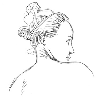
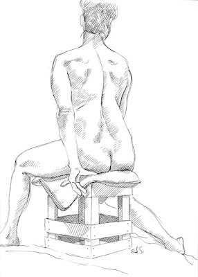
While I was on vacation, my wife saw a listing for an open life drawing class (not really a class- more of a free-for-all that cost $7). So I showed up and the room was already full- I was a little late as the address didn't make enough sense to the GPS on my phone- full of artists mostly in their later years with huge sketch pads, conté crayons, brushes, pastels etc, etc. And me with just my sketchbook and a ballpoint pen (I mean, I didn't expect to need anything more on vacation!).
We warmed up with a few 5 minute poses before jumping into one loooong drawing. The sketches above are from that same pose, just that I mived to the other side of the room to get a new vantage point.
I didn't put these drawings up because they're my favorites, I put them up because I was so happy to be drawing a live model and I wanted to remember how much fun it can be and how nice it is to sit in a room with other artists as if we were a community for more than just 2 hours. It's like the air is different (and it is- there's a lot of charcoal and pastel dust) or charged and you're all sharing an experience together. and you walk out with renewed energy for sketching/drawing. So if you're an artist, I strongly recommend that you get out now and then and draw with others and walk around and see how they approach the same problem (as in math problem, not in a negative way) you're faced with and watch yourself grow from the experience.
Tuesday, September 15, 2009
Bad time to answer the phone
 A recent sketch from my sketchbook:
Seems you can’t go anywhere without coming across someone talking on their phone with little regard for those around them. So I’ve started sketching various scenarios like this one. I’ll upload my Batman one to my blog once I have it worked out better. Now I’ve gotta go answer the phone...
Thursday, September 10, 2009
Aliens!
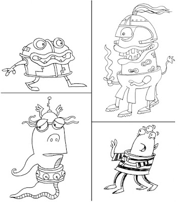
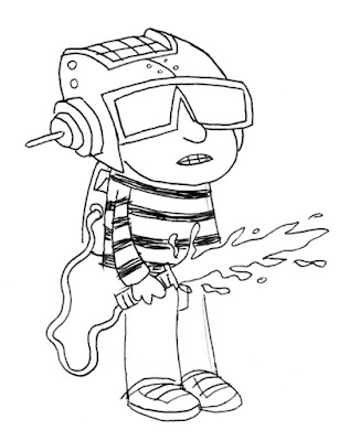 We just returned from vacation (which is why I haven't updated my blog in a while) and one morning while away, I was watching my son Leo play with anything that looked like it might be a toy. A toy golf club became a (leaf) blower. The sofa became a hub for all his (flying) cars. And his real toys- I could only imagine what he was seeing in them. And he was especially having fun with an alien toy. He has such a creative imagination that I thought I'd draw for him some aliens and a Leo character/warrior to play with them.
Wednesday, August 26, 2009
Frank Zappa poster (or Phi Zappa Krappa)
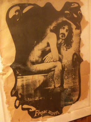
I took a quick va-cay in Vermont these last few days and came across this poster. I love the style, the subject matter is dead-on and even the way the poster is falling apart adds to the overall appeal. Where can I get one?
Tweet
Friday, August 14, 2009
HELVETICA
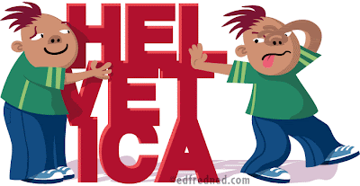 I saw the HELVETICA movie this week. Yes, it's a movie about a font, but it has a rich and interesting history and the movie is interspersed with a variety of designers (a few big names and then a few smaller ones) who either extoll the font's virtues or rip it to shreds.
It was nice to see how excited some designers were when they described HELVETICA while others were quite funny in their criticism (either of the font or those who use it).
I walked away uncertain whether or not I wanted to use the font ever again- and that's what this drawing is about.
Friday, August 7, 2009
Paul McCartney
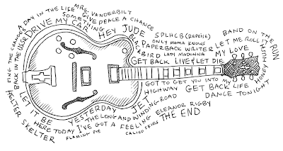
I went with my family to the Paul McCartney concert at Fenway Park in Boston yesterday and was wowed by the performance(s) and the venue so I decided to create a tribute. Illustrated above is one of Paul McCartney's guitars surrounded by the songs he performed.
Below is a photo I took on my iPhone which I had to enhance to try to get a better image (too many things conspired against me- a low-quality camera, bright skies behind a dark arena and vid screens that were often too bright for the camera to deal with).
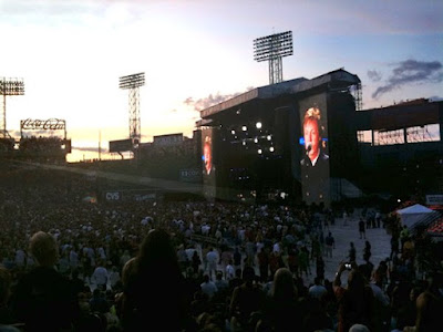 And then there is a video I took (again with the iPhone) of the light show and fireworks during Live and Let Die:
If you're a Beatles fan, this show would not have dissapointed you. What a great night!
Labels:
band,
Beatles,
Boston,
Fenway Park,
guitar,
illustration,
music,
Paul McCartney,
photo,
Photograph,
tribute
Wednesday, August 5, 2009
Baby- that's my logo!
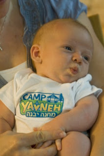 I was at a party with friends this past weekend when I spotted something familiar. A 7-week old named Jonah was sporting the logo that I had created for a summer camp! What a kick it was to see something I had designed, completely out of context and while in my civilian identity (when I wasn't working). Isn't he a cutie?
Here's the logo:
 The logo went through many, many incarnations before we finally settled on this look, these colors and the gazebo which is one of the first things you see when you drive into the camp. I'm very proud of how it turned out.
Labels:
Boston,
design,
final,
hand lettered,
identity,
Logo design,
photo,
Photograph,
t-shirt
Thursday, July 23, 2009
Harvard Square
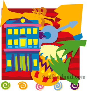
My tribute to Harvard Square in Cambridge, MA where you will always find a musician performing, usually right near the Harvard Coop (pronounced Coop, not Co-op) which is the building I depicted.
Nationally known performers who got their start in Harvard Square include Tracy Chapman and Joan Baez.
When you're not watching the street musicians, there are SO many great restaurants and stores to check out (Favorite restaurants: Border Cafe, Fire and Ice, Grafton Street).
Thursday, July 16, 2009
Wednesday, July 1, 2009
Keys
Tuesday, June 23, 2009
Vaulting ahead
Thursday, June 11, 2009
Cape Cod Map- download a free version
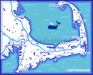
If you're heading to Cape Cod this summer, here's a simplified map I just finished illustrating and designing. I did a simpler version (1 color) for a wedding program and then decided to finish the map to a higher degree.
For a free higher resolution PDF of this map to actually use when you visit the Cape, click here to download it.
Monday, June 8, 2009
Following Instructions
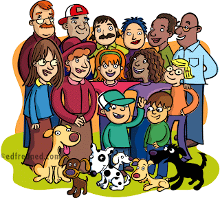
This is an illustration of a group of people I created for Flash Kids/Barnes & Noble books. The instructions were much more complex than what I usually get (draw a tree with a squirrel running on a branch, for example) and it took a lot of rechecking to make sure I got everyone right. Here's the description from my client:
Assignment: illustration of a group photo of 3 older men, 1 with short hair, 1 with no hair and 1 with long hair, 1 with glasses, 1 with a hat; 2 older women with short hair; 1 middle-aged man with no hair and glasses; 2 middle-aged women: 1 with a hat and short hair and the other with long hair and glasses; 3 girls, 2 with long hair and 1 with short hair, 1 wearing glasses; 2 boys with short hair 1 with glasses and 1 with a hat; 4 large dogs, 1 spotted black and white, another just black, and 2 golden; 1 small white dog; and 1 small brown dog.
Are you dizzy yet?
Tuesday, May 26, 2009
Housing market

An editorial piece I completed a few days ago about the housing market and how every house that gets sold is another step out of the recession hole. This could either be a broker or a buyer proudly displaying the house that has just sold.
So everyone, go do your part and buy a house. Or a cup of coffee...
Friday, May 15, 2009
What we read this week
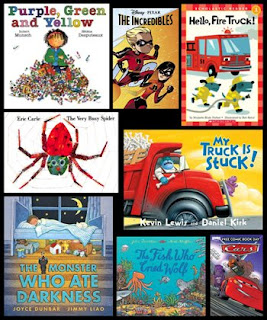 In honor of Children's Book Week, here is a collage of most of the books my wife and I read with our 3 1/2 year old son this past week. By Leo's decree, some books must be read every night (until he gets a new favorite) while others make the occasional appearance, cycling in and out.
The Fish Who Cried Wolf is a favorite book, beautifully illustrated and very engagingly written, but with what is easily the worst name. The original story (The Boy Who Cried Wolf) behind the name doesn't even strictly connect to this story and makes the book seem like just another carbon copy, but it is actually very originally written.
My Truck is Stuck is also nicely written with rhymes you can't get out of your head. Leo is now able to 'read' this book by himself because it flows so cleanly. Lots to see in the artwork.
Free Comic Book Day this year got my son stuck on Pixar's Cars and The Incredibles (which was a back-up feature to Cars). Cars was good and somewhat easy to follow (although he didn't get any of the irony which was a bit too subtle) but The Incredibles (written by the VERY talented Mark Waid) was a little too dense for Leo's age. When we read this one, we basically have to paraphrase the character development pages to keep him interested until the action starts again. Once there's jumping and running again (not much hitting), he loves it!
The last one I want to mention (among all of these great books) is Robert Munsch's Purple, Green and Yellow. Last night was my first time reading this book and I loved it! Although the drawing style is a little dated, the use of color was very appealing and nice to look at. And the story! Munsch has a way of packing so much into one story without overwhelming the reader. This short story could be turned into a movie adaptation making use of the interesting twists/occurrences in the book.
Now, I have to get back to drawing my own children's books!
Friday, May 8, 2009
2 (Cool) Old Guys
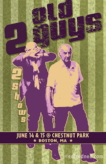
I decided to put myself through an exercise today: Design a poster that makes these old guys cool.
My motivation was to keep things fresh while also updating my website (this will go in the 'design' section under 'posters'). Yeah, I used some popular conventions in the design (the style of the photo, edgy type) but I hope you will agree that I made the design my own with the concept.
First, I decided that these guys should be in a band, and what better name for a band than going with exactly what they are? It helps that they are dressed hip (certainly better than I was dressed when I shot the photo in Boston. I recall a pair of flip flops.). Then I gave them a venue and a couple of performance dates. (If you took a few minutes to Google the venue you would find out that it's an assisted living community where the median age is 80. Just having fun!)
I considered putting something about the type of music they play but decided against it- leaving this out suggests that if you were cool you would already know what they play.
Labels:
2 old guys,
band,
Boston,
design,
edfredned,
final,
Fred,
music,
photo,
Photograph,
photorealistic,
poster
Friday, May 1, 2009
Wolverine's secret identity...
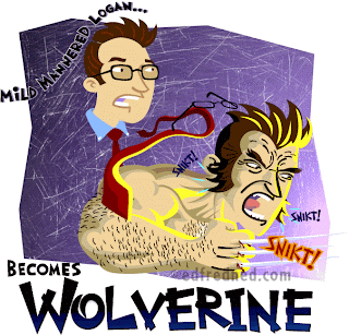
In honor of the new Wolverine movie, I was sketching the other day in my book and started playing with the idea: What if Wolverine had a secret identity (old-school style)? So I pretended that he's a normal-looking guy (with glasses and all) with a 9 to 5 as a real estate broker or a lawyer and when he hears the scream of a mugging victim he transforms, Hulk-style, into the feral, hirsute Wolverine!
My favorite part: The familiar 'SNIKT!" that you hear when he pops his claws also occurs when his sideburns pop out.
Oh, and those forehead lines are inspired by Art Adams (for those of you who remember his kick-ass Wolverine from The Asgardian Wars).
Hope you enjoy this make-fun piece...
Wednesday, April 22, 2009
Art Shmooze
 This is a logo I created recently for a non-profit artists advocacy group called the Graphic Artists Guild. I became president of the Boston chapter a few months back and have been working on building up membership and attendance to our events. One of our recurring events is an Art Shmooze: members and non-members get together to discuss current events in our industries, get help with hard/software issues, discuss social networking and drink some beer.
Really, I wanted to call the events "Shoot the Sh*t" but didn't think that some of our older members would appreciate that. Plus the imagery would have been visually quite unappealing.
The text is hand lettered and I created the icon to show exactly what the events are about: food goes in, words come out.
Tuesday, April 14, 2009
Logo Design- What to consider when it's time to hire a designer
Congratulations on your new business.
You've done the research, made a business plan and now you're finally ready to get your business off the ground. So now you need a logo to convey to everyone that yours is a serious venture with four sturdy walls and a leak-proof roof. Here are some things to consider before you hire a designer to create your new identity/branding system, and then a few while your designer is designing away.
1) What is the name of your business? You've probably given this quite a lot of thought and spent some time researching the name. Also be sure to secure a domain for the business before you spend money on a logo for a name that is already taken.
2) What do you want the logo to convey (who is your target audience)? Should it be serious, edgy, fun, conservative professional, corporate, young...?
3) What information do you want in your logo? Do you have a tag line? Do you want/need an illustration or icon?
4) Who is your competition? Provide your designer a list of competitors so s/he can get an idea of who you're up against. How do you differ from them?
5) Do some research. See what logos are out there and come up with an opinion on what you like and what you don't. I don't mean just trolling the web for an hour. I mean you should also be looking around when you go to the mall, when you flip through a magazine and when you go food shopping. Logos are everywhere and you can get an idea of what you think works and what does not work (icon or no? What color(s)? What shape?). Make a list. The more you immerse yourself in existing logos, the more you will know what will look good for your business (much like knowing about fashion before going into the store to buy an entire new wardrobe). Of course, you don't need to dictate to your designer every little thing- your research will help you to be more discerning when it comes time to look at his/her concepts.
6) See what others in your industry have on their letterhead. If you're in, say, the furniture business, do a Google search: Furniture, logo.
7) Avoid fads. Pink and chocolate-brown look great together. Will you still think so in a year? In 5 years?
8) Avoid lettering that will become dated. That funky font may have a 'best if used by' date.
9) Do not let/make the logo become too overcomplicated. It does not need to tell the whole story about your business, it just needs to be an identifier. And memorable.
10) Hire a designer with a body of work that is diverse (with logos that are fun, serious, edgy etc...) so you don't get stuck with options that look like the rest of his/her work.
11) Avoid overused icons. But if your new company is "Light Up My Room" and you feel you must have, say, a lightbulb, then it should be used in an innovative way. (Lightbulb logos. Some are innovative and some are less so)
12) Communicate with your designer. Make sure s/he understands your business (as you're the one who knows it best!), your views on what you do and do not like (see #5 above), your competition and your expectations. But also be open to your designer's suggestions- s/he has been doing this for a while!
13) Sign a contract. A contract is the only way to be certain that you will be getting what you need for the agreed-upon price. There should be a time line for the sketch phase and for finalizing the chosen logo. A number of rounds of sketches and sketch options per round should also be negotiated ahead of time (see #14 below). Also negotiate a kill-fee based on the % of work completed in case you or the designer needs to stop the work.
14) Request 2-3 different logo directions for each round of concepts. From there you can choose what is working and what is not. The designer should then take your input and make changes accordingly to one or two of the original directions. Or if the original concepts weren't hitting the mark then s/he should offer up 2-3 new concepts. I also recommend that you see the concepts on a simple white background so you don't get thrown off by whatever cool design or simulated effect is going on behind the logo.
15) Don't rush approval. Get feedback from friends, associates and family before giving your feedback to the designer on sketches or on finals. It's all about fresh eyes (You MUST look at this link to know what I mean- and for a laugh). Be clear in your feedback.
16) Logo versions. Other versions you may need:
- PMS or 4-color process version: For printing
- RGB version: For online use
- One color version: A simplified logo using one of your logo colors. For use on a fax cover page or if you're sponsoring a charity run, for example, they'll want to put a 1-color logo on their shirts to thank you.
- Black and white and gray: If you want to put the logo on a flier you're printing on your laser printer or photocopier.
- TIF: If you would like to slip your file into a Word document or Powerpoint.
- JPEG: If you want to put your logo on your Facebook page or Twitter or Flickr.
- Is the logo recognizable or forgettable?
- Does it properly target your desired demographic?
- Does it stand on its own?
- Is it legible (kind of obvious, but not for some)?
- If there is a tagline, what happens if the logo is used small?
- Letterhead (both offset printed and a Word version to print from your computer)
- Envelopes (of varying sizes)
- Business cards (for all employees)
- Email signature set up
- Signage (if you have a store front or for trade shows)
- Thank you cards
- Announcement cards
- Brochure
Labels:
business cards,
CD,
concepts,
contract,
design,
edfredned,
email signature,
envelopes,
facebook,
Flickr,
identity,
letterhead,
Logo design,
postcard,
sign,
signage,
sketch,
sketch to final,
twitter
What I'm working on- Sudoku
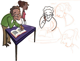 I've been (slowly) working on this story about a dad doing a Sudoku and his daughter thinking that just because she read online about the secret to doing the puzzles she can cruise through. Ultimately, she messes it up.
The final piece will be more of a comic page with panels but I wanted to show how I was drawing over my scanned sketches. You'll also notice just how much I'm revising from the sketch phase (that is, when I'm not working on a gig for a client. For clients, my sketches are much tighter so they know what they're gonna get when the piece is finished).
Since I'm working on real (paying) jobs, I'm just fitting this piece in whenever I have a chance so we'll see how soon I can get it done.
Thursday, April 2, 2009
Portrait for Twitter and Facebook
 Cindy Bernat is a successful real estate agent in NYC who decided she wanted to shake things up a little bit, which, during a down economy and terrible housing market, isn't such a bad idea. So she contacted me to illustrate her portrait for use on her Twitter and Facebook accounts (with a revamp to her email signature).
I worked from a photo she supplied me to create the portrait, then we discussed what the background might look like. My first pass (see below) was a background comprised of random New York buildings.
 Cindy felt that the buildings were too non-specific and the feel was of an area of NY that she doesn't represent. She also wanted to be wearing a white shirt with a collar and a more straight-forward necklace. She provided me with some thoughts of what she wanted in her background and I began to work on it.
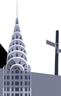 And then I pulled it all together, adding color but keeping the buildings a gray tone so they wouldn't compete with the portrait.
 Finally, as you'll see in the final image at the top of this post, we added the 'SOLD' sign and pulled her collar out to overlap her jacket (she knows fashion much better than I do!). And the image is complete.
If you want to see her new image in action, Cindy can be found at www.twitter.com/cindybernat
Labels:
design,
edfredned,
email signature,
facebook,
faces,
final,
Fred,
gray tone,
New York,
NYC,
photo,
Photograph,
photorealistic,
Portrait,
Real estate,
realistic sketches,
sketch to final,
twitter
Subscribe to:
Posts (Atom)


